[Visualization] Drawing a Q-Q plot using R and Python
Spring 2023
Junehyung Lee
Before we run parametrical statistical test, there are assumptions for the data that need to be met. And normality is one of the assumptions, which ensures that the data is normaly distributed and independent from outcome variable. Then, how do we check normality assumption before we run a statistical test? Of course you can run another statistical test (e.g., Shapiro-Wilk test) that examines whether the data is normal or not. But, looking a Q-Q plot is one of the easiest and quickest way without running a test.
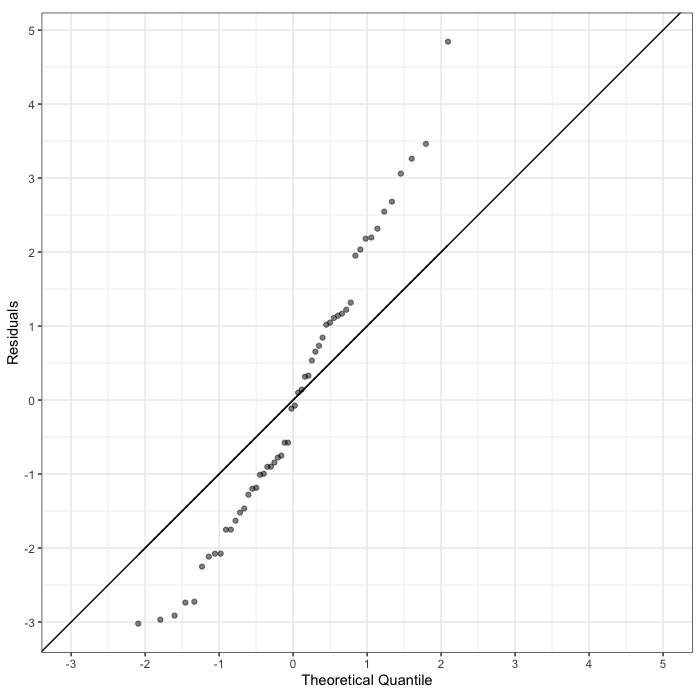
        qqplot_data %>% ggplot(aes(x=z_value, y=residuals)) + geom_point(alpha=0.5) + theme_bw() +

        geom_line(aes(x=z_value, y=z_value)) +

        scale_x_continuous(name="Theoretical Quantile", breaks=seq(-3, 5, 1), limits=c(-3, 5)) +

        scale_y_continuous((name="Residuals"), breaks=seq(-3, 5, 1)) +

        coord_fixed() +

        geom_abline(slope=1, intercept=0)